A team that ships, and nobody to say no
Lithosquare builds a platform for mineral exploration. Several modules, several teams, and one unusual trait: a lot of people here create interfaces without being designers.
Product Managers build them. So do FDEs, and developers of course.
When I joined in June 2026, the situation was this:
No designer on the team. I was the first designer to join Lithosquare.
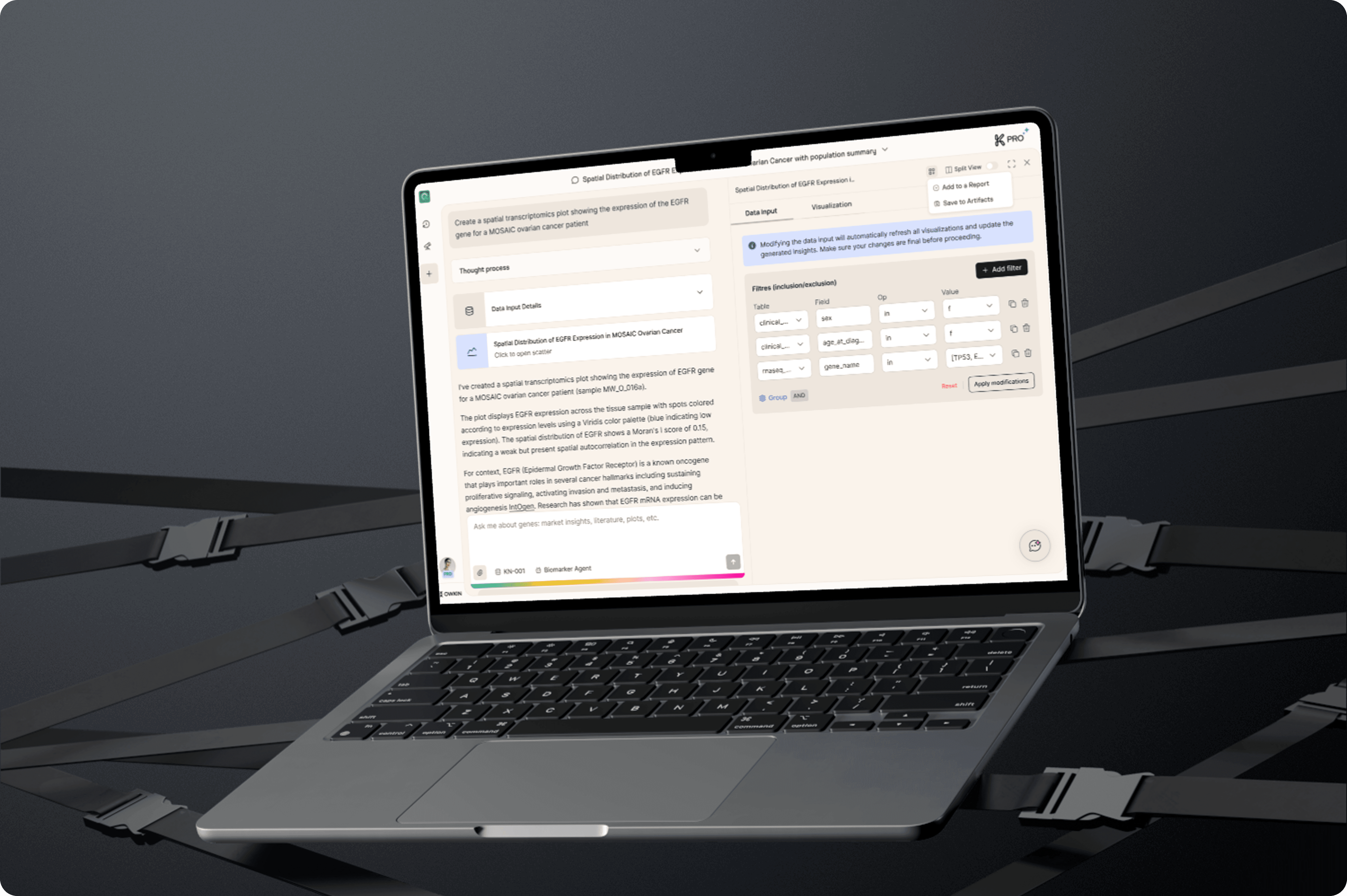
The applications were built with Lovable, a tool that generates an interface from a description. Fast, very effective to get started, but every application started over with its own components.
A design system had been started, a component library called Anthropocene, young and barely used outside the main application.
One project was already on the table when I arrived: gathering these independent applications into a shared OS, a single platform where each application becomes a module, with shared navigation and one visual identity. And that OS would run on the design system.
It is a good project, and it contains a trap. Unifying once is a piece of work with an end date. If nothing changes in the way things get produced, divergence starts again the day after delivery.
Four workstreams, and one that goes first
An audit on arrival, then several conversations with the CPO, surfaced four workstreams. Some were explicitly part of my mission, others came out of what I observed. Mostly I had a say in their order.
Build the system that lets anyone ship a correct interface.
Unify the modules inside the OS.
Design and ship new features.
Set up user research.
The first one went ahead of the rest, for a simple reason: everything else follows from it. And workstreams 2 and 3 became its proving ground. Every module unified, every feature shipped was a chance to check whether the rules held under real conditions, and to fix them when they did not. Building the system in a quiet room would have produced a theoretical system.
One designer facing a team that produces interface continuously cannot work through review. The guardrail has to be in the path, at the moment the work happens, not after.
What “building an interface” means here
Before getting to the system, you need to picture the gesture it frames.
You do not design and then code. You prompt an agent connected to the repository: you describe what you want in plain language, it writes the code, you look at the result in your browser, you correct, you go again. A complete interface comes out in a day.
This shifts the designer’s place entirely. The checkpoint is no longer the mockup you approve before coding, since there may not be a mockup at all. The checkpoint is the rules the agent reads while it works.
That is what the rest of this is about.
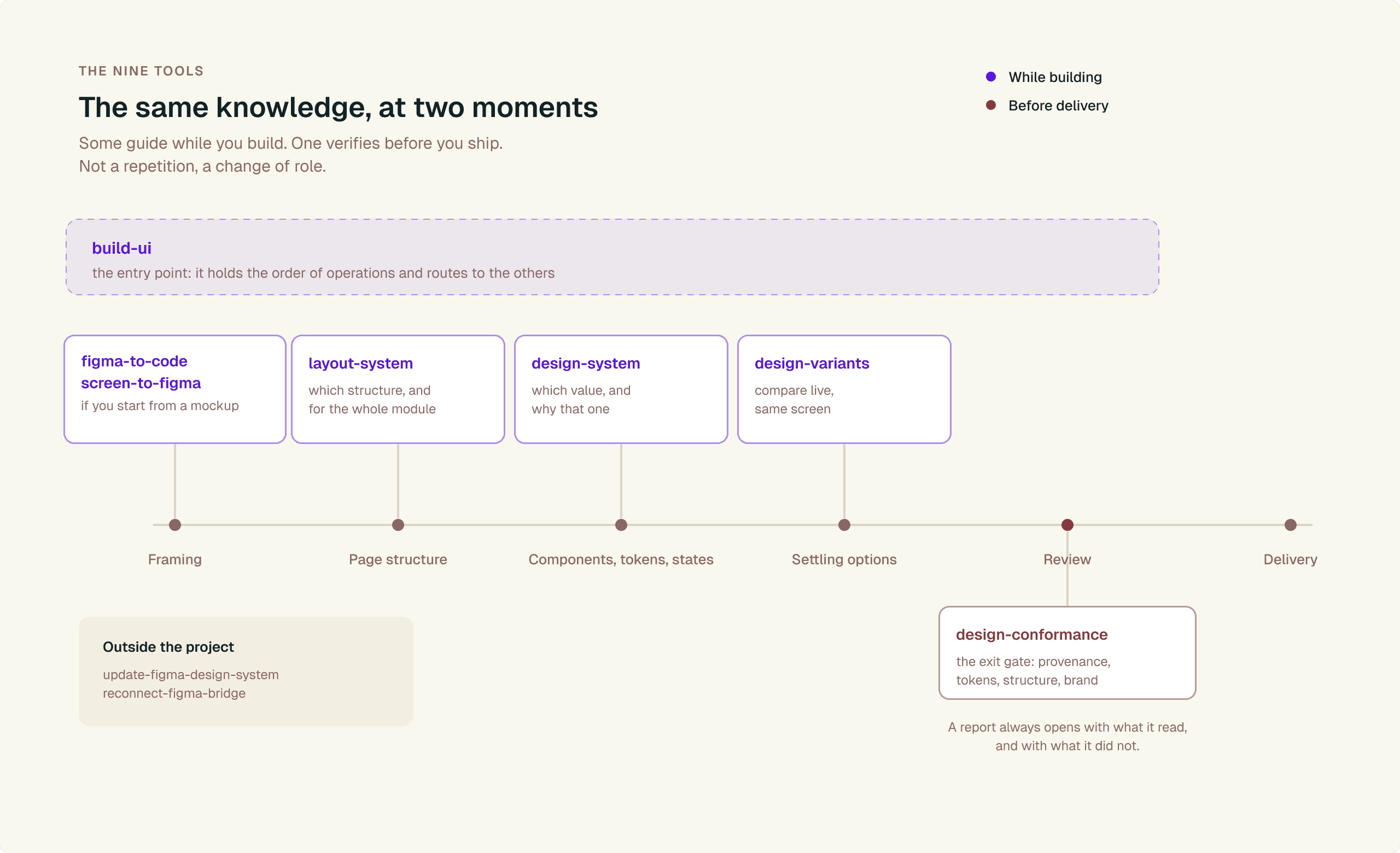
The nine skills on a project timeline
Four layers, one idea
The guiding idea: each layer has to work without anyone remembering to call it. A rule you have to remember to go and find is not a rule, it is documentation.
Layer 1 · The code is the authority
This is the decision everything else rests on.
The design system lives in the code, and the code is the authority. Not a Figma file, not a spec document, not a decision made in a meeting: the component library, as written and published. If a color, a spacing value or a state exists, it is because it is defined there. If it is not there, it does not exist.
Which means Anthropocene is the only source of interface. Not the recommended source, not the default. The only one. No second component library, no hardcoded color, no hand-made copy of a system component.
That last rule deserves an explanation, because it is the least intuitive one, and because copying is an AI’s natural reflex. Ask an agent for a component: rather than going to fetch the one that exists, it tends to rewrite a very close one inside the project folder. That is more direct for the agent, and the result on screen is identical. Rigorously so. Nobody can see the difference, not by eye and not by reading the code.
Except that the day the design system moves, the copy does not. The divergence is invisible on day one and unrecoverable six months later, when there are forty of them.
A library that grows with the domain. It would be wrong to describe Anthropocene as a fixed catalogue you simply consume. A good part of my work went into adding components specific to our domain, the ones no generic library will ever ship: the geological map and its tool panels, the page structure components of the OS, the scientific chart display, the domain status indicators.
The logic is always the same. When a need appears in one module and will repeat elsewhere, it does not stay in that module: it moves up into the design system, and the other modules inherit it. That upward movement is what keeps a library alive, not the generic components.
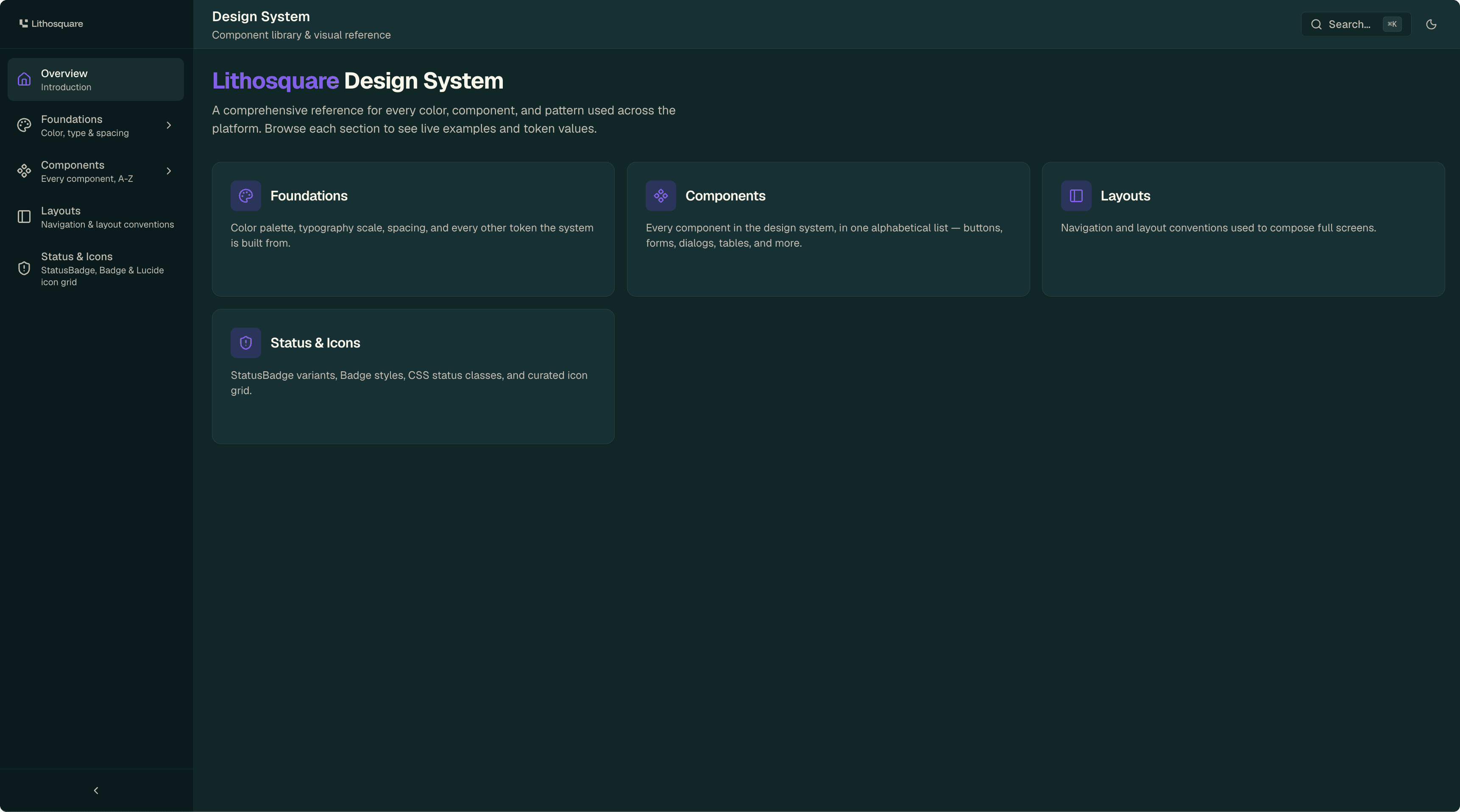
Design system showroom.
The boundary that was missing. An absolute rule with no explicit exception gets worked around by the first good reason that comes along. So the line had to be drawn, because some interfaces legitimately need specialised tools: a map, a scientific chart, a three-dimensional scene are not drawn with form components.
The line is this one, and it is easy to remember:
What draws the data is free. The plot itself, the map canvas, the 3D scene. Those are specialised tools, and that is expected.
What draws the interface around the data comes from the design system, always. The frame, the buttons, the legends, the tooltips, the empty state when there is nothing to show, the loading state.
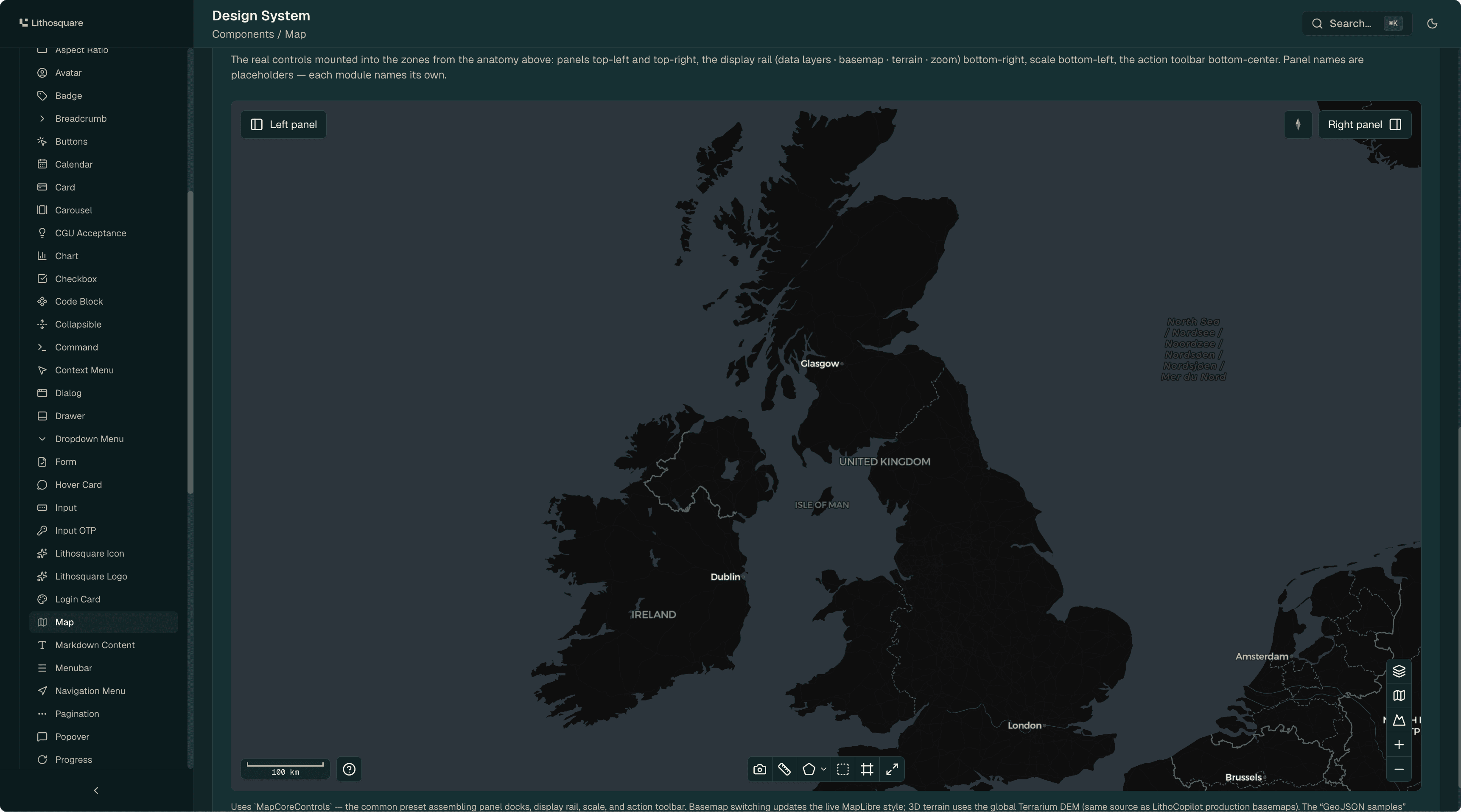
The map
And the means to hold to it. A rule is only worth something if it can be applied. Saying “do not rebuild the navigation, import it” assumes it exists in the library. It did not. I built it and shipped it. The rule became executable the day the component existed.
Layer 2 · What gets read without being asked
To understand this layer, you need to know how a coding agent receives its instructions. There are two kinds.
Context files. They are read automatically when a working session opens, without anyone asking for them. The agent has them in front of it at all times.
Skills. These are detailed instruction sets, stored separately, that the agent goes and fetches when it judges that the request matches their subject.
And the second point deserves honesty: a skill loading is never guaranteed. Even when the subject matches perfectly, the model decides, based on the skill’s description and on how the request happened to be phrased. It works often. Not always.
That uncertainty drives everything else. A rule stored in a skill applies if the skill loads. A rule stored in a context file applies, full stop.
Hence the sorting. What has to hold no matter what goes into the always-read files:
The design system is the only source of interface.
The boundary between what draws the data and what draws the interface.
Before building a component, check that it does not already exist. It takes three seconds and it prevents the invisible duplicate.
Page structure is not freeform: navigation elements are imported, not redrawn.
What is decided once, for an entire module, is the chrome: the navigation and where the actions live. What varies from page to page is the content inside it. A page whose content fills the screen, a map for instance, falls outside that model, and that is exactly why a fourth structure exists.
Building a screen follows an order, and getting the order wrong is expensive: structure first, then the component inventory, then colors and spacing, then the cases that are not the happy path, then open the browser, then audit.
How we make sure they are read: they are written in the file the agent opens unconditionally, placed at the root of the repository and in the modules folder, short and imperative. No long explanations, no nuance. The detail lives elsewhere.
And the rest stays on demand, deliberately. The full list of available colors, the recipe for an audit, the procedure when the Figma connection drops, how to set up a comparison panel: all of that is called when the subject comes up, and that is fine. These are subjects you do not meet every session, and whose absence breaks nothing.
The reason for the split is practical. Put everything in the always-read file and it gets long. And a long file is skimmed, by a human as much as by a machine. Scarcity is what gives authority. Six short rules that actually get read beat forty that get skimmed.
Layer 3 · Nine tools, two moments
The on-demand tools, then. A skill, concretely, is an instruction sheet written for the agent: when to use it, what to check, in what order, and the known traps.
I wrote nine of them. They fall into two families, and that split is the most useful thing I understood on the subject: they carry the same knowledge at two different moments. During construction, to guide. Before delivery, to verify. It is not a repetition, it is a change of role, like the difference between the assembly instructions and the quality check at the end of the line.
During construction
build-ui. The entry point: This is the one that answers “build this screen”, “add a page”, “start a new module”, “migrate this app onto the design system”. It holds almost no rules itself. Its job is to hold the order of operations and to route to the right tools at the right moment: choose the page structure first and have it confirmed, then inventory the existing components, then apply colors and spacing, then handle the awkward cases, error, empty, loading, then open the browser and actually look, then audit. Getting the order wrong, typically deciding the structure last, means redoing everything.
design-system. Which color for what, and why that one rather than the one next to it that looks the same. Spacing. What should happen on hover, on click, when an element is disabled. The maximum width of a column of text. And the known traps of the library, the ones that cost an hour when you do not know them.
layout-system. The possible page structures are finite and each one has a name. This tool says which to pick for a given module, where the actions go, how the sidebar collapses, and how a conversational assistant composes with a map or a document when they share the screen. Naming each case matters more than it sounds: you cannot choose between options that have no names.
design-variants. When there are two or three proposals to settle, this tool builds a switcher inside the application itself, visible in development only. Same screen, same data, instant toggle. It avoids comparing from memory between two versions opened one after the other, which is the surest way to pick the last one seen rather than the best one.
figma-to-code and screen-to-figma. The two directions of translation. Hand over a mockup and get code that uses the library’s real values, or take an existing screen and rebuild it in Figma with the right variables. Either way, the point is to never go through anything approximate.
update-figma-design-system. Re-syncing the Figma mirror when the library has moved, with its audit built in.
reconnect-figma-bridge. What to do when the connection between the agent and Figma drops. Unglamorous, very useful: without it, everyone improvises for twenty minutes.
Before delivery
design-conformance. The exit gate: The audit to run before offering your work. It looks for hardcoded colors, spacing that does not come from the system, non-conforming page structures, missed brand standards, and above all provenance: where does this component come from, a real import or a local copy? The report always opens with what was read and what was not.
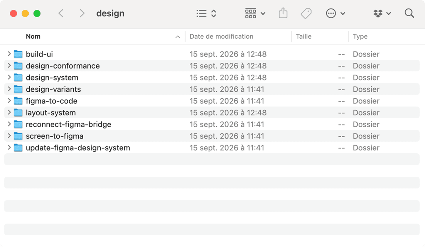
The nine skills.
Layer 4 · Documentation that is not written for designers
One question remains: where does everything go that fits neither in the code nor in an automatic rule? The why. The trade-offs, what was tried and set aside, how we work together.
The answer lives in two places, with two clearly separate roles.
The design showroom, first. It is a separate application, in the repository, that displays every component of the design system for real: you see them, you interact with them, you read their variants and their states. I added a page there documenting the available page structures with their usage conventions. What makes it valuable is that it cannot lie: it is built from the library, so it always shows the library’s real state. Zero maintenance, zero possible drift.
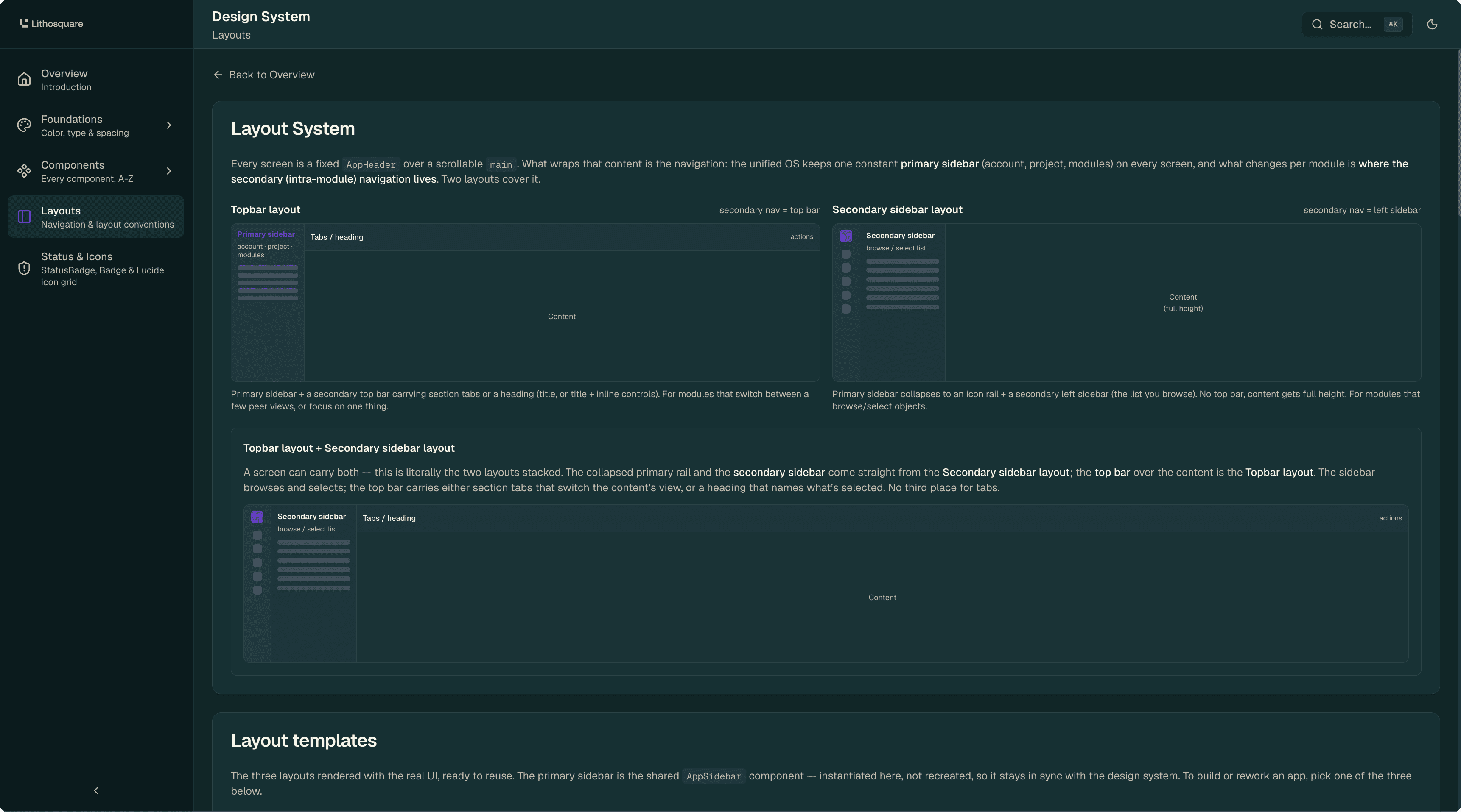
The layouts page.
A written documentation space, second, for everything a component does not say about itself. Ten sections, and above all three entry paths, none of which is “the designer”:
the developer who wants to build a correct interface without having to think about design,
the person who is not a designer and has to design anyway, typically a Product Manager or an FDE,
the person who maintains the design system itself.
Writing for those three changes everything. You cannot assume the vocabulary of design is known, you cannot lean on a shared culture, and you have to accept that the reader is looking for one precise answer, not a linear read. The first page takes two minutes and says the essentials: we build in code, Figma is optional, here are the three doors depending on who you are.
Two writing principles, learned by doing.
The narrative on one side, the technical detail on the other. The documentation tells the decisions and points to the code for exact values. It does not copy them. A document that copies the code becomes wrong at the first change, and wrong documentation is worse than none, because people trust it.
A dated decision log. Every important trade-off is recorded there, with its date and its reason. It stops the same debates from being replayed every quarter, and it lets someone joining understand why things are the way they are, rather than reading them as historical accidents.
One detail I am pleased with: the section on team rituals stayed empty, marked “none for now”. It would have been easy to invent a weekly review to fill the box. An empty and honest box beats a ritual nobody will keep.
Figma has not disappeared, it moved
A fair question, especially from a designer.
Figma is still useful, for three precise reasons.
Ideation, when exploring ten directions in Figma costs less than exploring them in code. That is often the case at the very start of a subject, when the shape is still unknown. A quick sketch, a screenshot handed to the agent, and back to code as soon as the direction is found.
Onboarding. If a designer joins the team tomorrow with fifteen years of Figma habits, they can be productive immediately, with the right components and the right values at hand. Forcing them into code on day one would be an expensive way to lose three weeks. The mirror is an on-ramp.
Discussion. Rebuilding an existing screen in Figma makes it possible to comment on it, to take it apart, to propose a variation without touching the product.
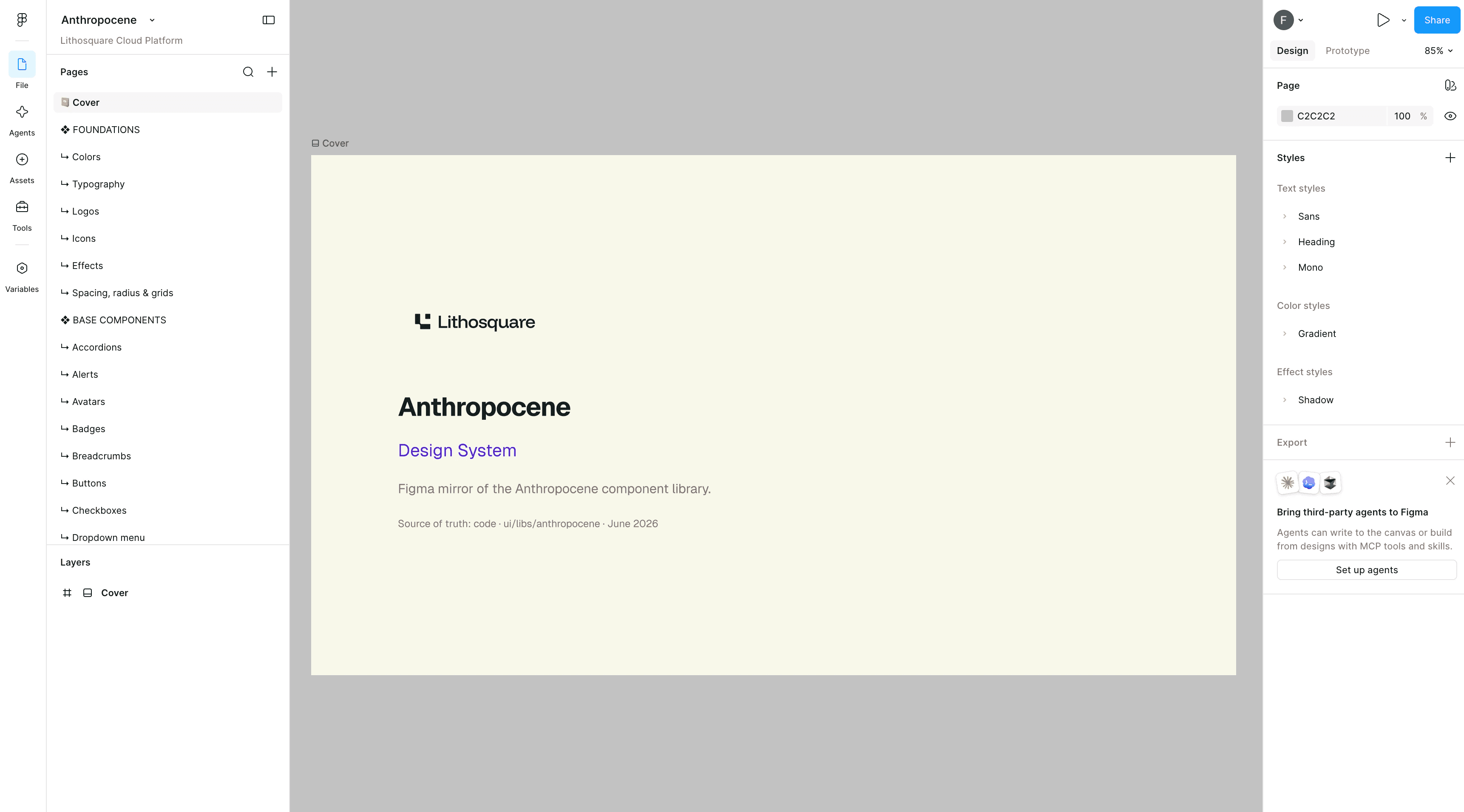
The Figma mirror.
That mirror was built in two days from an empty file, and it is serious: 92 variables, about 25 text styles, 96 icons, some sixty components across 54 pages. Today the code library holds more than 100 variables and more than 60 components, which is proof that a mirror is either re-synced or stale. Every Figma name is the exact identifier the code exports, and every component state comes from its real definition: a button has a default, a hover and a disabled state, a badge has no disabled state because the code has none. We do not mirror what does not exist.
Final check, run by script across the whole file: 290 text layers out of 290 attached to an official style, 714 color fills out of 719 bound to a variable. The remaining five correspond to a dark surface hardcoded in the code as well. The exception is faithful, not sloppy.
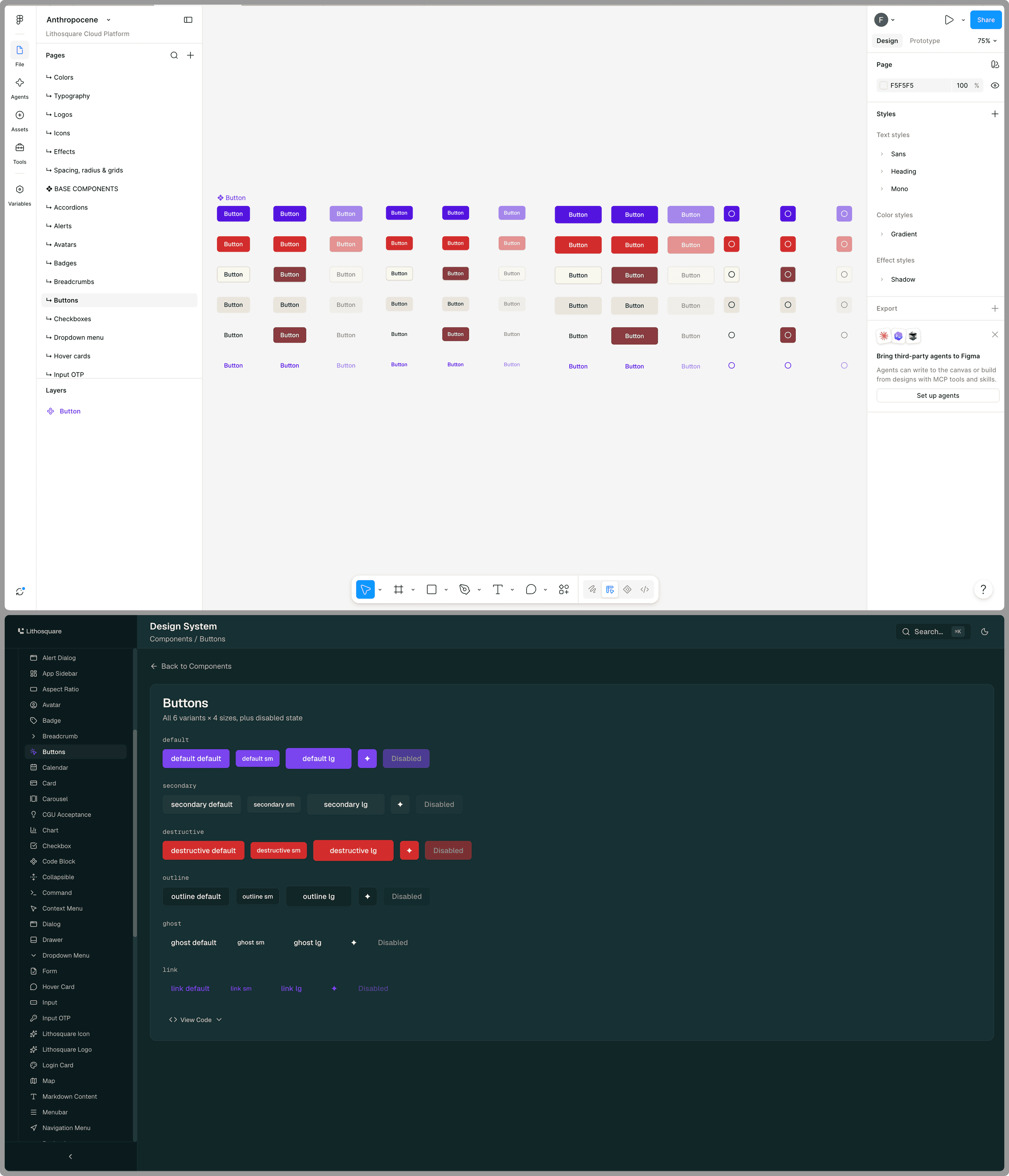
The 1:1 mirror.
Figma is not a delivery format, though. You do not hand a mockup to a developer and wait for them to translate it. Designers, like everyone who creates here, ship code. Figma is a sketchbook, an on-ramp and a mirror. Useful, optional, and never at the end of the chain.
The real product is the system
This is the point I care most about, because it is where the designer’s craft is being decided right now.
A system like this is not written once. It wears against reality, and most of the work is watching how it behaves once it is out in the open, then correcting it. This is ordinary product design, except that the product is the rules and the users are my colleagues.
I gather signal in four ways:
I talk to the people who build. Product Managers, FDEs, developers. What they found painful, what they worked around, what they did not understand.
I read their conversations with the agent. This is the richest source, and the most honest. You see exactly which rule loaded, which one was ignored, and the precise moment the person gave up and did it their own way.
I inspect the code that ships. A gap in the code is a gap in the system, never a fault of the person.
I measure how the tools are used. How often they loaded, on which phrasings, with what result.
One example
An FDE integrated a module by prompting normally, never calling a tool explicitly. Exactly the scenario the system exists for.
Three things did not work.
The tools did not load. One out of three. The phrases meant to trigger them were written in my vocabulary, not in the vocabulary of people at work. Nobody asks to “apply the page structure system”, they ask “where do I put the menu”.
The audit looked at too little, and reassured anyway. It had only examined the recent changes, not the whole module, and it returned a positive verdict while real problems were sitting there. A falsely reassuring audit is worse than no audit at all.
A full copy of the design system went unnoticed, sitting in a folder inside the module. Invisible, because every check compared what a component renders, never where it comes from.
Four corrections came out of it.
The trigger phrases were rewritten from the way people actually speak, in French as well as in English, and the entry point was widened to cover “build” as much as “migrate”.
An audit can no longer answer “conformant” and stop there. Every report opens with what was read and what was not, and it examines the whole module by default.
A family of provenance checks was added: where a component comes from, not what it renders. That is the only check that would have caught the copy.
The page structure has to be stated and confirmed before any code is written, so it can no longer be chosen in silence.
The new version was retested with five naive requests in fresh sessions, phrased the way someone who does not know the system would phrase them. The rules apply, and the provenance check finds what the previous version let through.
Four things I did not expect to learn here
Triggering comes before content. This is the most useful reversal of the engagement, and it runs against the grain when you come from design. You polish what you say first. But an excellent rule that does not load at the right moment is worth exactly nothing. The problem was not what the rule said, it was that it was not in the room.
A check that cannot say what it did not read is not a check, it is a permission slip.
A gap is never the person’s fault. If someone works around a rule, it is because working around it was easier than following it. The correction goes to the rule, not to the person.
The designer is no longer the bottleneck, and that is good news. When a Product Manager and an engineer can ship an interface in a day, the work moves toward rules, guardrails and verification. That is not a demotion, it is a change of scale: you no longer draw one screen, you make every screen other people will draw come out right.
There is no manual yet
What I have described here did not exist two years ago.
Design and tech are going through a shift in 2026 that none of us has finished digesting. Producing interface is no longer the bottleneck. The mockup is no longer the mandatory checkpoint. People who are not designers ship product every day, and they ship it decently.
Nobody really knows how this is done yet. There is no reference method, no training, no ten-year retrospective. Design system best practice as it is taught was shaped for a world where a human read the documentation before coding, and that is not quite the world we work in.
So we feel our way. We set a rule, we watch what it produces, we correct it. Some of what I described here will probably be wrong in a year, and some of it already was after three months.
That is exactly what makes the subject interesting. We are not following a manual, we are writing one, with the means at hand, and accepting that we will be wrong on a regular basis. For a designer, it is probably the most uncomfortable and the most exciting period in a long time.